The stamp a minister tried to stop
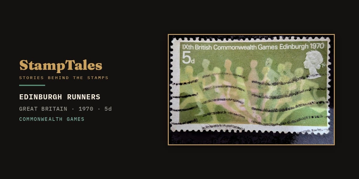
The runners on this stamp are going out of focus on purpose. There is no fault in the printing — Andrew Restall drew them that way, a line of pale figures smearing into the green as they lean at the tape. It is one of the strangest sports stamps Britain ever issued, and in the autumn of 1969 a government minister tried to stop it reaching the Queen.
His objection was not that it was ugly. It was that it looked, to him, like a fading empire.
| Issue | IXth British Commonwealth Games, Edinburgh |
|---|---|
| Issued | 15 July 1970 |
| Denomination | 5d |
| Country | Great Britain |
| Designer | J. Andrew Restall |
| Printer | Thomas De La Rue & Co (Delacryl lithography) |
| Size | 41 × 24 mm |
| Catalogue | SG 832 |
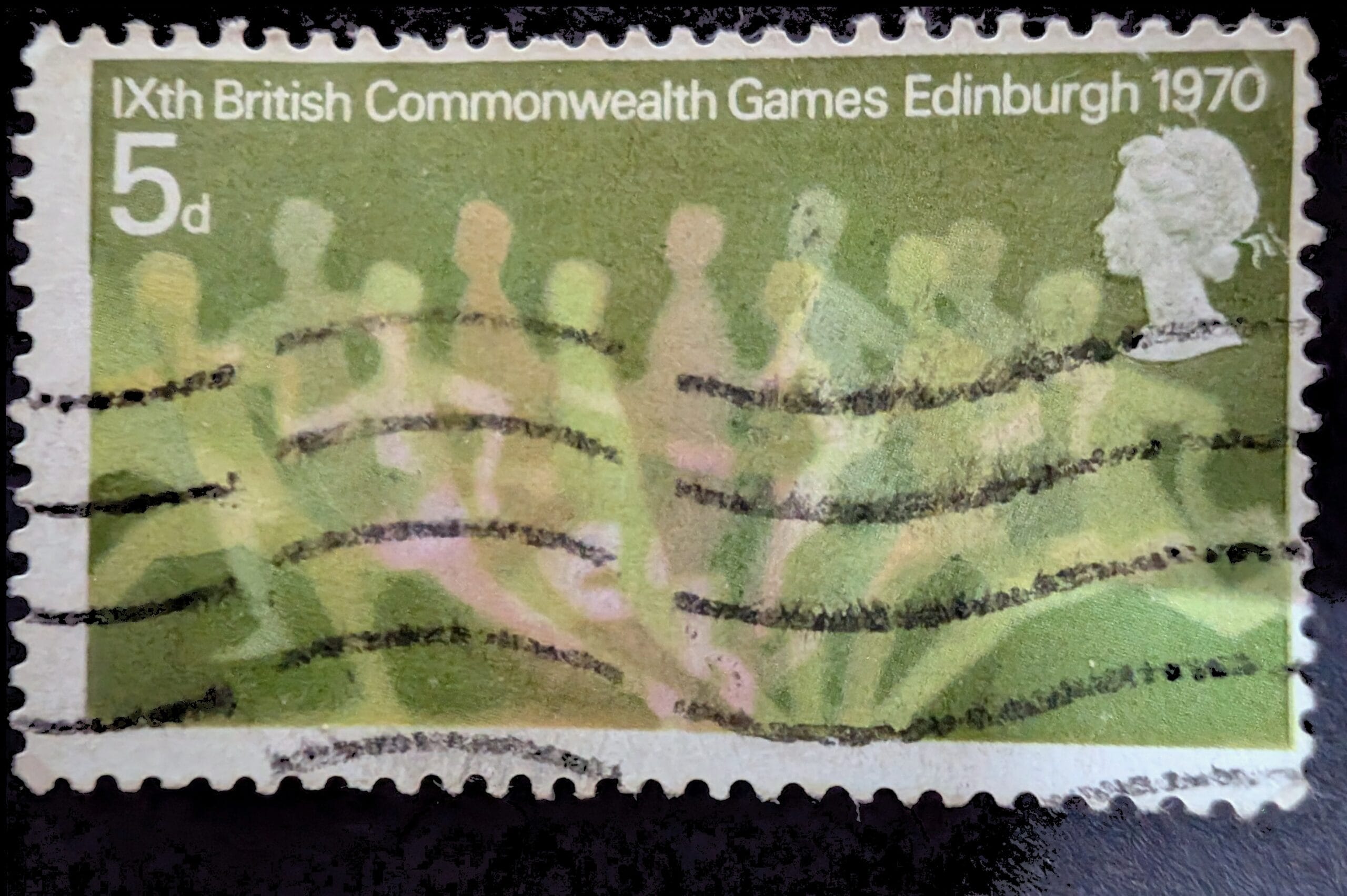
Why the runners on the Commonwealth Games Edinburgh 1970 stamp are blurred
Line up almost any sports stamp of the period and you get the same thing: a single clean athlete, mid-stride, sharp as a diagram. Restall did the opposite. His figures are printed as a blur because the blur is the subject. He was borrowing a technique from athletics itself — the multiple-exposure photograph, where a body caught many times on one frame becomes a study of motion rather than a portrait of a person.
On the stamp the runners overlap, dissolve and repeat across the finishing tape, so that what you read is not “a runner” but the fact of running: speed made visible by refusing to hold still. A related instinct appears two decades later on India’s XI Asian Games issue, where a field of running figures turns motion into the subject rather than portraiture.
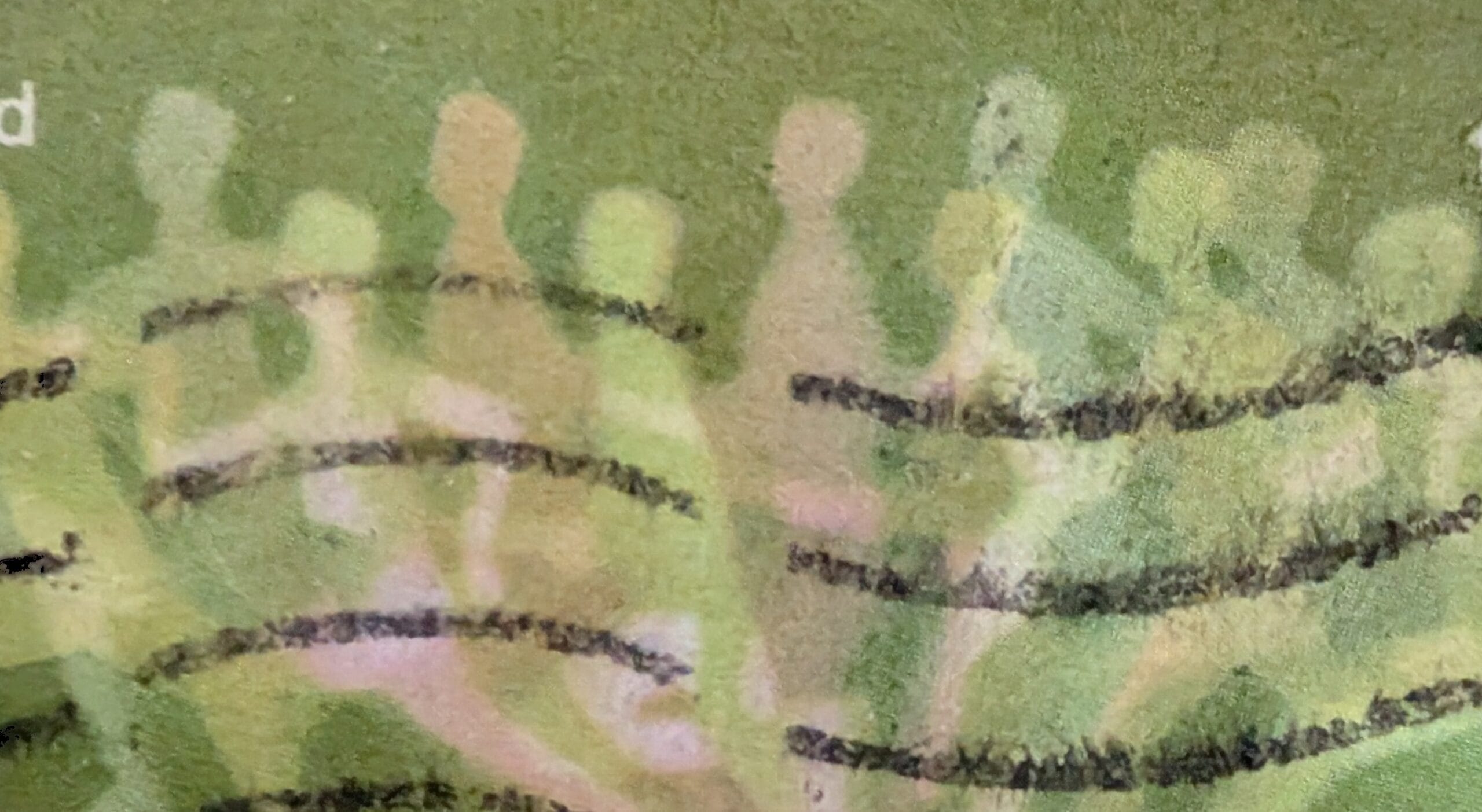
The idea was clever. It was also divisive. Restall had spent two years on a Royal College of Art fellowship investigating what stamp design could do, and he pushed his set of three — runners, swimmers, cyclists — well past the “average run of athletics and sports stamps churned out by the dozen,” in the words of one Post Office official who otherwise disliked them. The Stamp Advisory Committee, which included a former chairman of the Tate trustees, welcomed the essays as a fresh answer to a tired theme. The people who judged art for a living could see exactly what he was doing.
The public reaction was less charitable. Once it was out, one critic likened the figures to “a load of ectoplasm emerging from a sewer”; another claimed the printer had been “pouring whisky into the ink troughs to fuddle the machines.” A blurred runner, it turned out, is very easy to mistake for a mistake.
Why the Commonwealth Games Edinburgh 1970 stamp alarmed a minister
The real fight happened before any of that, in private, and it is the reason the stamp is worth an article. In November 1969 the designs went up for the routine step of being submitted to the Queen. The Minister of Posts and Telecommunications, John Stonehouse, refused to pass them on.
His secretary put his reasoning in writing, and it is worth quoting. The figures, Stonehouse felt, “look ghostly,” and the designs “might well be taken as implying that Britain considers the Commonwealth to be an insubstantial pageant faded, leaving not a rack behind.” He wanted something “more robust” that “would remind the Commonwealth that it is a living community of peoples.”
The phrase echoes Prospero’s, from The Tempest — the speech in which palaces and towers dissolve and “leave not a rack behind.” In 1969 that was not an idle literary flourish. Britain was two decades into decolonisation, watching the map change colour year by year, and here was a British stamp about the Commonwealth in which the participants literally faded into the background. Stonehouse looked at Restall’s motion study and saw an admission — that the whole enterprise was thinning into nothing. He was not wrong that the image could be read that way. He was wrong about whether that was a reason to kill it.
The Post Office’s senior management thought the issue should go ahead, at least. Its managing director, who had privately scrawled “I think they are terrible!!” on the very same designs, nonetheless defended them upward as a choice between “a low quality, if fairly safe” set and one “of really high quality, even if it may lead to some controversy.” An internal note went further, accusing the minister of hunting for “a political excuse for rejecting a design he does not like.” Faced with a straight choice between Restall’s set, a batch described in-house as “cheap and nasty,” and cancelling the issue outright, Stonehouse gave way. He submitted the designs on 20 November; the Queen approved them four days later.
What the stamp refuses to blur
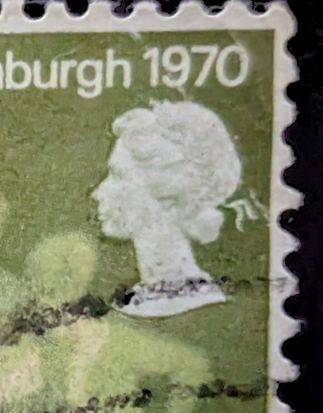
There is a quiet joke in how the stamp resolves all this. The figures dissolve into the green; two things, however, remain perfectly crisp.
The first is the head of the Queen at the top right — not a flat silhouette but a modelled profile built from light and shade. The committee had actually asked him to flatten it to a plain outline; Restall argued to keep the fuller “semitone” head and won. So the sovereign’s profile stays sharply defined in the corner while the athletes stream past in a haze beneath the tape. Whatever Stonehouse feared the design said about a dissolving Commonwealth, the Crown at least is in perfect focus.
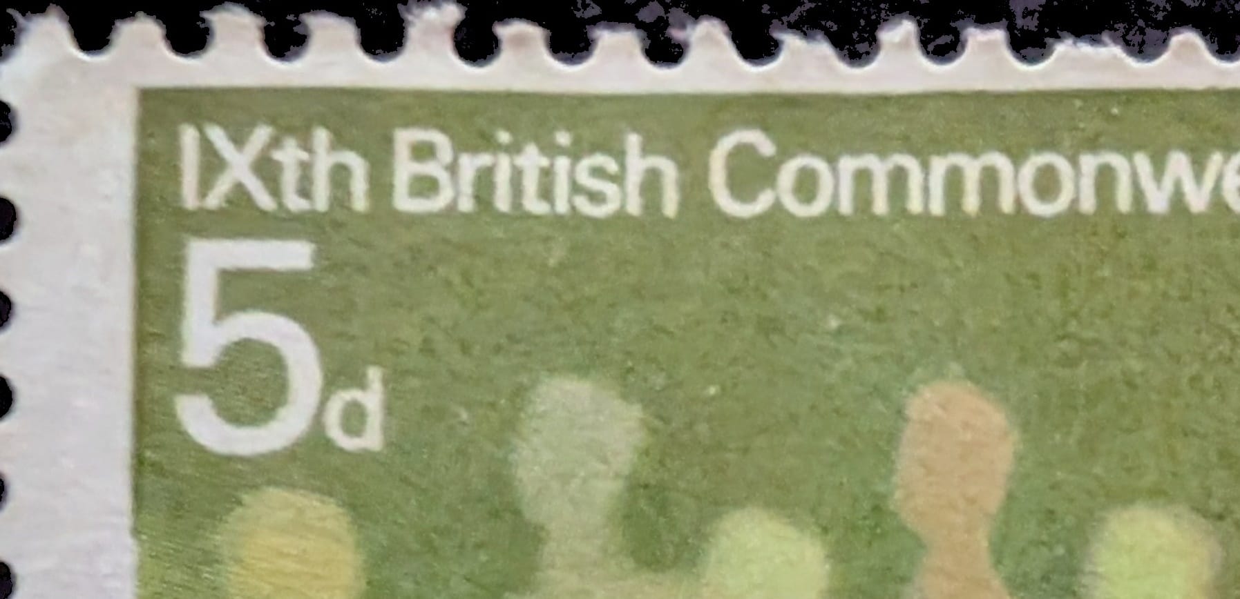
The second is the lettering. “IXth British Commonwealth Games Edinburgh 1970” and the white 5d are set with hard, clean edges against the green, as legible as a road sign. The information is fixed; only the people move. It is the exact inversion of a normal stamp, where the picture is solid and the text is incidental — and it is why the design still looks modern more than half a century on, long after the tidy single-athlete stamps of its rivals have blurred, in memory, into one another.
The Edinburgh Games themselves make a useful counterpoint to the minister’s fears. These were the first to carry the name British Commonwealth Games, the first held in Scotland, and the first to run every event in metric units — an old institution visibly remaking itself rather than fading away.
Stonehouse feared a stamp that admitted things were dissolving. What Restall actually made was a stamp about the one moment in a race when everything is still in play — bodies not yet resolved into winner and loser, the result still a blur. A finish-line photograph freezes that instant into a fact. This stamp does the braver thing and leaves it moving.
Further Reading & Links
- Special Stamp History — IXth Commonwealth Games (The Postal Museum) — the full archival account, including Stonehouse’s “insubstantial pageant” objection and the internal correspondence.
- 1970 British Commonwealth Games (Wikipedia) — the first Games to use the British Commonwealth name, to be held in Scotland, and to run entirely in metric.
- Andrew Restall (1931–2024), Open Eye Gallery — the designer’s biography and stamp work between 1964 and 1983.
- Ninth British Commonwealth Games issue (Collect GB Stamps) — technical details of the three-stamp set, SG 832 and its companions.